


Color on the Plate: Applying Color Theory to Elevate Presentation and the Dining Experience
Color in culinary presentation studies how hue, value, saturation and temperature work together to direct attention, suggest flavor and shape how a dish is judged. Chefs arrange complementary, analogous or monochrome palettes to create harmony or deliberate contrast—choices that influence appetite, perceived richness and memorability. This guide distills the essentials of color theory, practical plating techniques and the ways color psychology and premium ingredients combine to produce striking fine‑dining moments. Using Kaviar’s modern Japanese omakase as a reference, we show how a unified color story can run through a tasting sequence. You’ll find concrete plating tactics (layering, negative space, focal points), visual comparisons of premium ingredients like A5 Wagyu and caviar, and hands‑on ideas for photographing and annotating menus. With theory, step‑by‑step techniques and visual checklists, this piece helps cooks and food stylists design plates that look as intentional as they taste.
What is Color Theory and How Does It Influence Food Plating?
In plating, color theory explains how relationships between hue, saturation and temperature produce balance or contrast on a plate and set expectations about flavor. Opposing hues draw the eye to a focal ingredient, high saturation signals freshness or intensity, and warm tones read as richness while cool tones suggest brightness and acidity. Mastering these relationships lets chefs shape perceived taste and pacing—using warm sauces to imply umami or cool garnishes to refresh the palate. This section outlines practical principles you’ll apply in the techniques and pairings that follow.
Understanding Color Harmony in Culinary Presentation
Color harmony describes how chosen hues relate on the color wheel to create a deliberate effect on the plate. Complementary pairings—colors opposite one another—deliver vivid contrast, for example a bright herb against a deep glaze. Analogous palettes rely on neighboring hues for subtlety and refinement. Monochrome approaches downplay hue and rely on variations in tone, value and texture to build depth on minimalist plates. Chefs select a harmony to match a dish’s intention—bold contrast for statement courses, analogous schemes for delicate seafood, monochrome for quiet simplicity—so harmony becomes a narrative device across a multi‑course sequence.
How Color Psychology Affects Diners’ Perception
Color psychology shapes appetite, perceived richness and emotional response through a mix of cultural associations and biological cues. Warm reds, oranges and ambers tend to make dishes feel heartier; cool greens and blues communicate freshness and acidity. Sensory research shows that color intensity and contrast can alter reported flavor strength and even perceived saltiness, so chefs use saturation to amplify or temper taste expectations. These psychological levers inform menu pacing—warmer palettes can build toward a climax, while cooler palettes offer palate resets between richer courses.
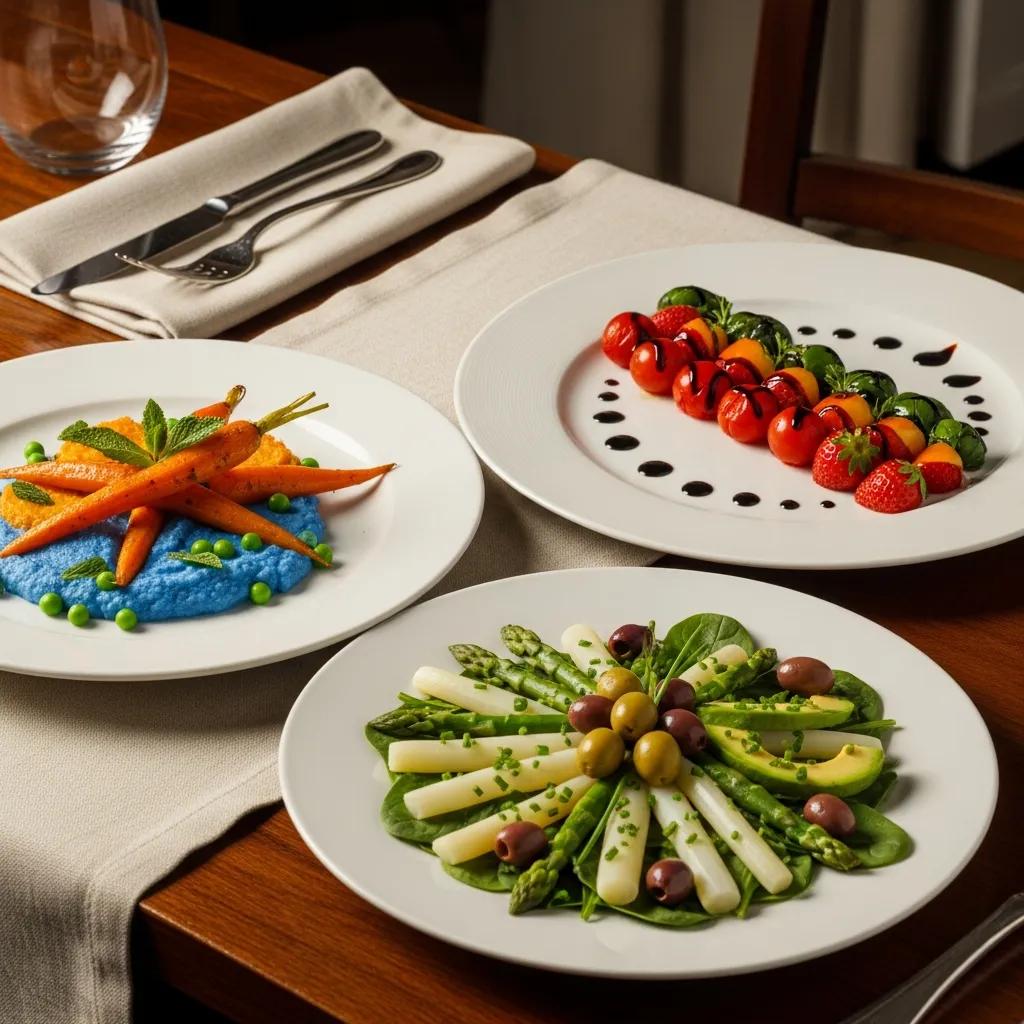
Which Food Plating Techniques Best Showcase Color Contrast and Harmony?
Plating techniques translate color theory into spatial composition: contrast, layering, negative space and focal punctuation guide the eye and clarify a dish’s hierarchy. Composition—placing elements by color, scale and texture—creates clear visual pathways that highlight the hero ingredient while supporting flavors. Practically, chefs combine plate choice, smears and garnish color to heighten contrast or unify a palette. The subsections below describe omakase approaches and adaptable aesthetic tips for different cuisines and plate shapes.
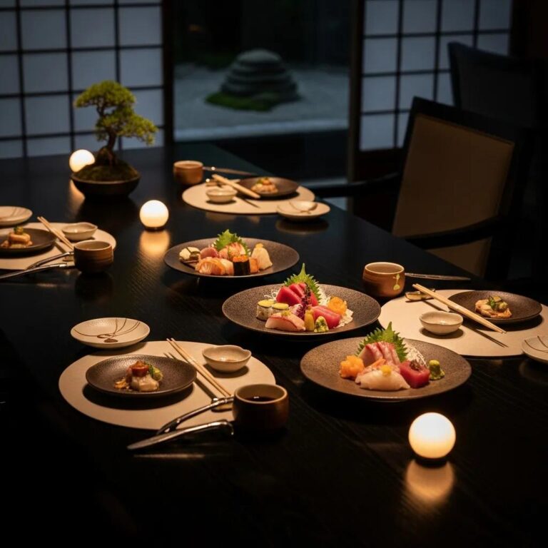
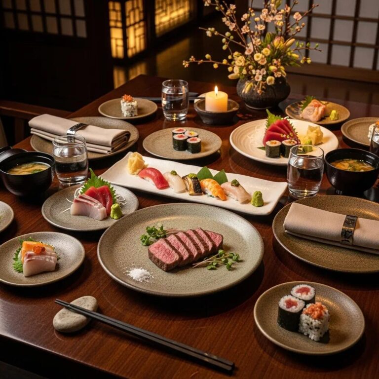
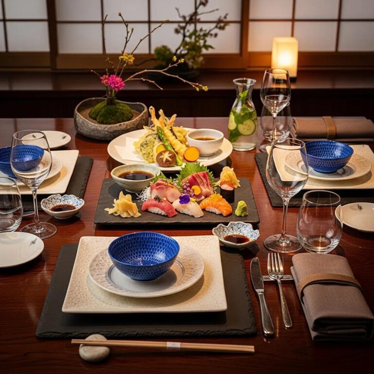
Omakase Plating Styles Featuring Vibrant Ingredient Colors
Omakase emphasizes seasonal color and nimble chef decisions that showcase freshness in single‑bite or small‑plate moments. Chefs build a color narrative across courses so complementary and contrasting hues evolve with the tasting. Small portions allow bold color punctuation—bright uni, glossy roe or a sliver of pickled vegetable—that read as focal points against neutral ware. Thinking in sequence helps chefs direct attention and ensures each course contributes to a cohesive visual and flavor arc.
Aesthetic Plating Tips for Balancing Visual Elements
Balance depends on scale, negative space, texture contrast and judicious color accents to avoid overcrowding and keep the plate legible. Use negative space to isolate the focal ingredient and elevate perceived value; limit vivid accents to one or two instead of many competing colors. Texture—glaze sheen, matte purées, crystalline salt—adds depth that supports color choices. If a plate feels busy, troubleshoot by removing one garnish or switching to a subtler plate color to restore clarity.
This list highlights three core techniques to emphasize color in plating:
- Contrast Backgrounds: Select a plate color that opposes the ingredient’s dominant hue so colors pop.
- Layering and Height: Build verticality to reveal multiple colors and create shadowed depth.
- Negative Space: Preserve empty areas to define the focal point and reduce visual clutter.
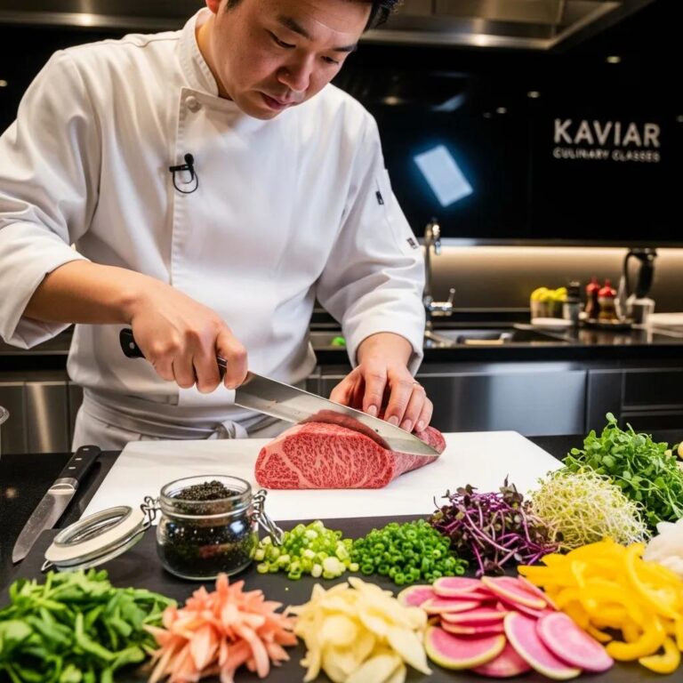
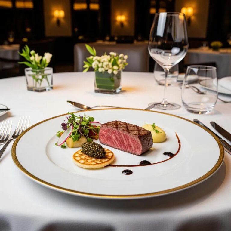
How Do Premium Ingredients Like A5 Wagyu and Caviar Enhance Colorful Food Presentation?
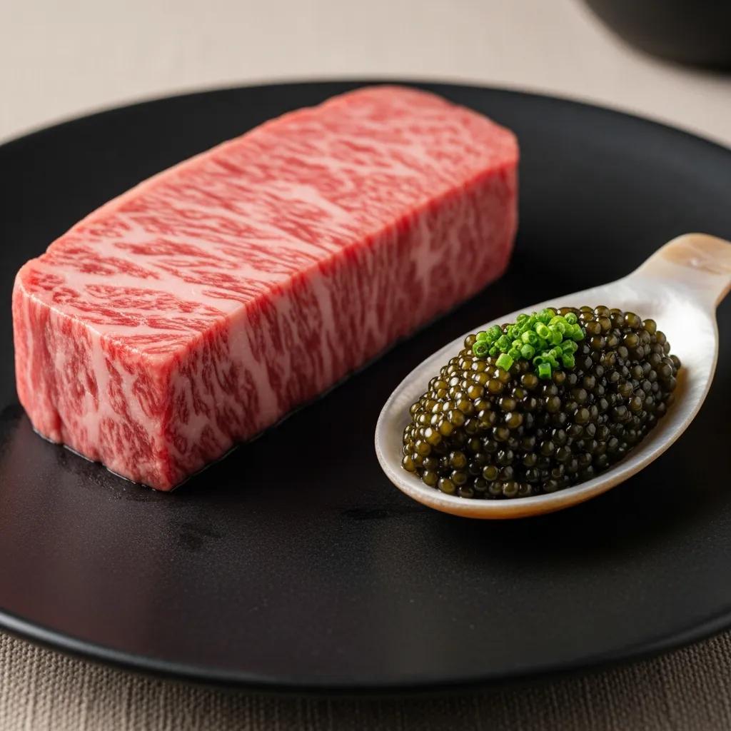
Premium ingredients bring distinctive visual qualities—marbling, sheen, translucency and bead‑like texture—that chefs use as anchors or delicate accents. Their visual power comes from rarity and surface character: gloss and translucence catch light and draw the eye. Plated thoughtfully, A5 Wagyu’s warm marbling and caviar’s lustrous beads become focal points that either unify a palette or punctuate it, depending on whether they lead the plate or play a supporting role. The sections below compare roles and offer simple rules for matching plate color and finish.
Introductory table explaining visual attributes and plating roles:
Visual Impact of Rare Ingredients in Fine Dining
Rare ingredients amplify perceived value through visual distinctiveness: sheen, translucency and unique texture demand attention more quickly than muted components. A chef can increase “visual prominence” by isolating a rare item on neutral ware, adjusting light to enhance gloss, or framing it with contrasting color swatches. Photographers and diners notice different cues—photographers chase reflective highlights and texture, while guests often first register saturation and balance—so plating that considers both perspectives performs better on the table and in images.
Integrating Ingredient Colors with Plate Design
Plate color, shape and finish either amplify or subdue ingredient hues; the choice follows simple do/don’t rules that support your composition. Matte, pale plates keep glossy, saturated ingredients from glaring; dark, satin finishes add drama to warm proteins. Pair garnishes—microgreens, citrus zest, petals—to echo or counterpoint the main hue, avoiding an unrelated third color. This checklist of plateware choices helps ingredient color and plate design work together to send a clear visual message.
Key plateware choices to match ingredient palettes:
- Matte Pale Plates: Use for glossy, saturated ingredients to minimize reflections and emphasize color.
- Dark Satin Plates: Use to dramatize warm‑toned proteins and increase perceived richness.
- Small Accent Dishes: Use for beads or sauces to contain color and focus attention.
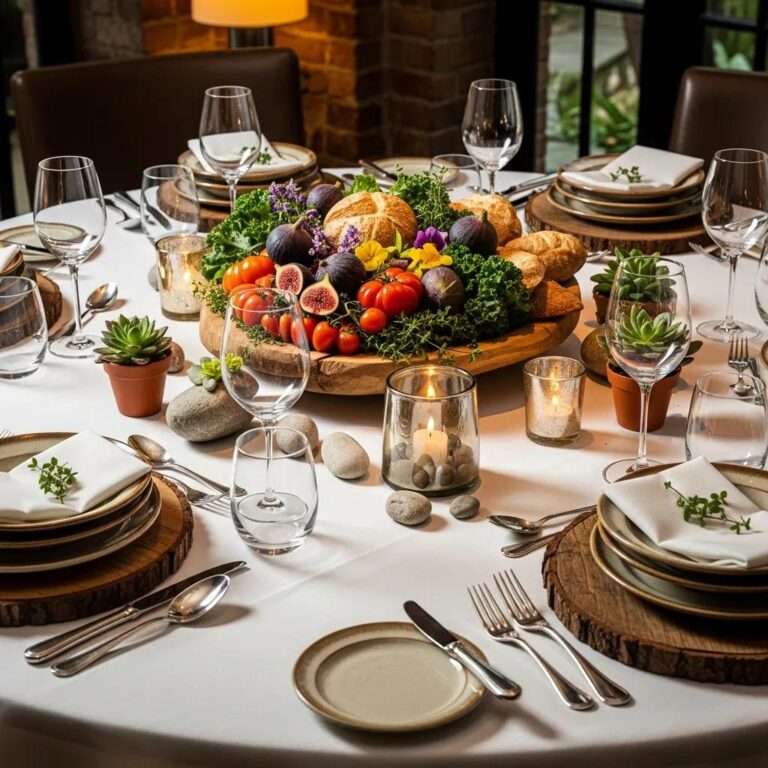
What Are Effective Food Presentation Ideas to Maximize Color Appeal?
To maximize color appeal, combine deliberate palette planning, precise garnish choices and clear photographic annotation so dishes read both on the plate and in images. The principle is constraint: a coherent palette and a limited set of garnishes create a readable color story that supports flavor cues and imageability. This section offers a stepwise palette process, garnish recommendations and guidance for building annotated galleries that help menus convert reservations.
Introductory table showing techniques, examples, and recommended plate color:
Using Color Palettes and Garnishes for Artistic Plating
Choose a palette in three steps: identify the hero hue, add one complementary or analogous accent, and keep the rest neutral and textural. Match garnishes to the palette—herbs and microgreens for green accents, citrus zest for yellow/orange punctuation, edible flowers for soft analogous tones—and use them sparingly so they support rather than overpower. Vary textures so color reads with depth rather than flatness. These rules make plates that communicate clearly to diners and photograph cleanly for menus and galleries.
Palette selection process in three steps:
- Choose the Hero Hue: Start with the dominant color of the main ingredient.
- Add One Accent: Introduce a complementary or analogous color for contrast or harmony.
- Limit Neutrals: Use textures and neutral tones to support without competing.
Visual Galleries of Signature Dishes Demonstrating Color Theory
Well‑annotated galleries teach color theory by pairing images with swatches, ingredient callouts and concise plating notes that explain the choices and flavor cues. When assembling gallery images, use ALT text that references the palette and primary ingredients—terms like “A5 Wagyu,” “caviar,” “omakase” and “plateware finish” help with clarity and discoverability. For each item include a palette swatch, a focal ingredient label and a one‑line plating note, plus a gentle reservation prompt directing readers where to experience the dish in person. Thoughtful annotation aids guest education and improves image search performance.
Gallery annotation elements to include for each image:
- Palette Swatch: Color chips showing major and accent hues.
- Ingredient Callouts: Short labels naming hero components and garnishes.
- Plating Notes: A one‑line explanation of the color strategy and technique.
How Can Diners Experience the Psychological Effects of Color in Food at Kaviar Restaurant?
Guests feel color’s influence through the interplay of plating, light and service pacing; together these elements turn a series of plates into a curated story. At Kaviar we design omakase progressions so color and temperature shifts guide attention and refresh the palate between richer courses. Diners get the most when plating choices, ambient light and timing are coordinated to preserve color integrity and heighten the multisensory impression. The sections below explain how lighting and pacing change perception and offer concise reservation advice for a color‑forward omakase.
Multisensory Dining and Color-Driven Ambiance
Ambient light changes how colors register: warm light enhances reds and ambers, while cooler light preserves greens and blues. Chefs and front‑of‑house coordinate lighting and plating so intended hues read as designed. Thoughtful pacing gives guests time for visual inspection, photography and palate adjustment, strengthening memory and emotional response. If you want to notice subtle hues and sheen, choose seating near neutral backgrounds or ask for a spot with minimal reflective light. Understanding these multisensory interactions deepens appreciation of deliberate color choices.
Reservation Tips for Enjoying Colorful Omakase Experiences
To enjoy a color‑forward omakase, book during service windows with steady or natural light and tell our team if you have photo preferences so we can offer optimal seating. Sharing dietary or presentation preferences when you reserve helps the kitchen plan balanced, color‑aware courses and can enhance the visual flow of the tasting. Observe polite photography etiquette—avoid flash and long exposures that disturb others—to preserve the intended color experience for everyone. These simple steps increase the chance you’ll see plates exactly as the chef intended.
Three quick booking and etiquette tips:
- Request Optimal Seating: Ask for a table with steady, neutral lighting for photos and accurate color perception.
- Share Presentation Preferences: Let us know if you prefer minimal garnishes or emphasis on a particular ingredient when booking.
- Respect Lighting Etiquette: Avoid flash photography that alters how colors appear to others; use ambient‑friendly methods.
This reference table summarizes core ingredient roles and helps chefs and diners see how color‑driven choices translate on the plate.
We’ve covered the theoretical foundations, practical techniques, ingredient strategies and guest‑focused tips for applying color theory to plating. Use the checklists and examples here to design presentations that communicate flavor intent, elevate perceived value and create memorable multisensory sequences.
Frequently Asked Questions
1. How can I apply color theory to my home cooking?
Start simple: pick a hero ingredient, add one complementary or analogous accent, and use neutral textures to support them. Choose a plate color that helps your main element stand out, and experiment with layering and negative space to create balance. Small, deliberate choices make everyday meals feel more considered and appealing.
2. What are some common mistakes to avoid in food plating?
Common missteps include overcrowding the plate, introducing too many competing colors and ignoring negative space. Overcrowding flattens hierarchy; instead focus on one or two focal points and let empty space frame them. Aim for simplicity—restraint almost always reads as more refined.
3. How does lighting affect the perception of food colors?
Lighting has a big impact: warm light deepens reds and ambers, cooler light preserves greens and blues. Inconsistent or harsh lighting can distort hues, so aim for steady, neutral illumination when you want colors to read accurately. Consider seating and time of day when color is important.
4. What are some plating techniques to enhance color contrast?
Use contrasting plate backgrounds, layer components to reveal multiple colors, and reserve negative space to highlight the focal element. Choose plate colors that oppose the dominant hue of your centerpiece, and vary textures to add depth and interest.
5. How can I photograph my plated dishes effectively?
Rely on natural or steady ambient light and avoid harsh shadows or glare. Use a neutral background to keep focus on the food, try overhead and slight‑angle shots to find the best perspective, and include simple props that complement the palette. Optimize camera settings for accurate color capture and avoid flash when possible.
6. What role do garnishes play in food plating?
Garnishes add color, texture and visual cues about flavor. Choose garnishes that complement the hero ingredient’s color and taste, and apply them sparingly so they enhance rather than overpower. A well‑chosen garnish completes the plate’s story.
7. How can I create a cohesive color story across multiple courses?
Plan your menu with a consistent palette in mind. Select a dominant theme and carry it through courses with complementary or analogous accents. Think about progression—warmer tones for richer courses, cooler tones for palate resets—to create a memorable visual narrative.
Conclusion
Thoughtful use of color elevates both presentation and the dining experience by signaling flavor, guiding attention and engaging the senses. By combining hue, texture and composition, chefs can create plates that feel deliberate and memorable. Apply these principles to refine your plating and invite guests to see—and taste—your intent. Explore more techniques and start shaping your own color stories today.