

How Food Presentation Shapes Perception: Plating Techniques and Visual Aesthetics for Fine Dining
Presentation is the careful arrangement and visual styling of a dish that sets expectations and changes how we experience flavor. In this piece we unpack how visual signals act as cognitive cues—shaping perceived taste, quality, and value—and offer practical plating guidance, ingredient spotlights, and context for fine dining and omakase. You’ll learn the psychology behind plating, the concrete techniques chefs use to steer perception, and why ingredients like A5 Wagyu and caviar read so powerfully on the plate. We also outline the omakase progression as a curated narrative, and show how ambiance and a smooth reservation experience complete the luxury impression. Throughout, we connect these principles to the practice of an upscale Japanese fine‑dining venue in Pasadena, illustrating how presentation, pacing, and service combine into a coherent multisensory experience.
What Is the Psychology Behind Food Presentation?
Presentation is a bundle of visual signals that interacts with expectation and multisensory integration to shape how flavors are experienced. Sight often leads and biases taste judgments: appearance sets a predicted flavor profile, crossmodal links (color, texture) cue specific taste qualities, and focused composition directs attention to key elements. Sensory science shows that color saturation, symmetry, and perceived freshness all influence reported intensity and quality. Understanding these cognitive drivers gives chefs practical levers to design guest experience—and helps diners understand why the same ingredients can taste different when presented differently. From this foundation we move to the concrete mechanisms by which visual cues alter perceived taste.
Visual cues reach the palate through several pathways, and chefs use those routes intentionally to enhance flavor and perceived value.
How Does Visual Appeal Affect Taste Perception?
Visual appeal shapes taste by building expectations that interact with incoming flavor signals—often boosting perceived intensity or shifting pleasure judgments before the first bite. High color contrast can suggest sweetness or freshness; symmetrical plating communicates balance and polish. Research links glossy surfaces to richness, and vertical compositions to complexity and depth. Practically, a sashimi course plated with vivid garnishes and generous negative space will read as fresher and more refined than the same fish placed without contrast. Recognizing these mappings lets chefs design plates that prime desired taste interpretations while minimizing heavy seasoning.
These perceptual correspondences explain why aesthetics matter—next we look at their role in fine dining beyond flavor alone.
Why Is Food Aesthetics Important in Fine Dining?
In fine dining, aesthetics signal craftsmanship, value, and memorability—lifting a meal from sustenance to an orchestrated moment. Meticulous plating suggests superior ingredients and technical skill, which raises perceived quality and willingness to pay. Distinctive visuals also aid memory: courses that look striking are more likely to be recalled and recommended. In upscale settings, presentation becomes social currency—shared photos and word‑of‑mouth amplify reputation. These cognitive and social functions make aesthetics a core tool for chefs shaping lasting impressions, and they lead directly to the plating techniques that deliver those impressions.
Which Food Plating Techniques Enhance Visual and Sensory Appeal?
Plating techniques translate perceptual theory into actionable design choices that guide attention, create contrast, and cue taste expectations. Core approaches include color contrast, negative space, vertical layering, textural juxtaposition, and purposeful garnishing—each produces predictable sensory and cognitive results. Below are practical “quick wins” chefs use across courses, followed by a clear reference table linking technique → visual cue → ideal usage.
Common plating techniques that reliably sharpen perception:
- Color Contrast: Use complementary or saturated hues to amplify freshness and suggest sweetness.
- Negative Space: Leave considered empty areas to spotlight the main ingredient and convey refinement.
- Layering/Height: Introduce vertical elements to communicate complexity and richness.
- Texture Juxtaposition: Combine glossy, creamy components with crisp or powdery elements to emphasize balance and mouthfeel.
These foundations clarify which approaches to choose—see the table below for when each technique performs best.
Different plating methods produce consistent visual cues and sensory outcomes that help chefs make design choices.
This quick comparison helps chefs and diners see which techniques amplify particular perceptual goals and prepares us for Japanese plating traditions next.
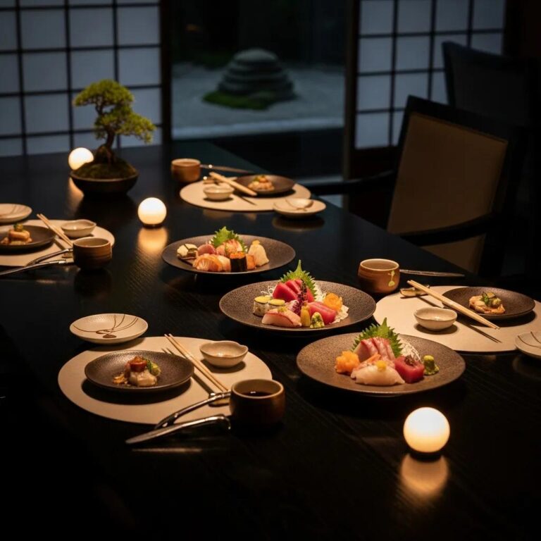
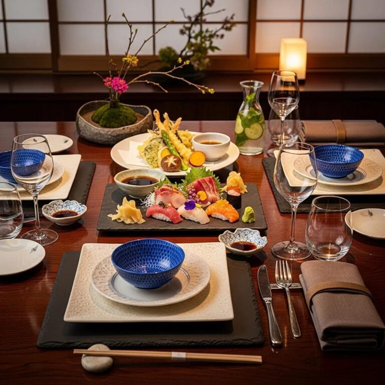
What Are the Signature Plating Techniques in Japanese Omakase?
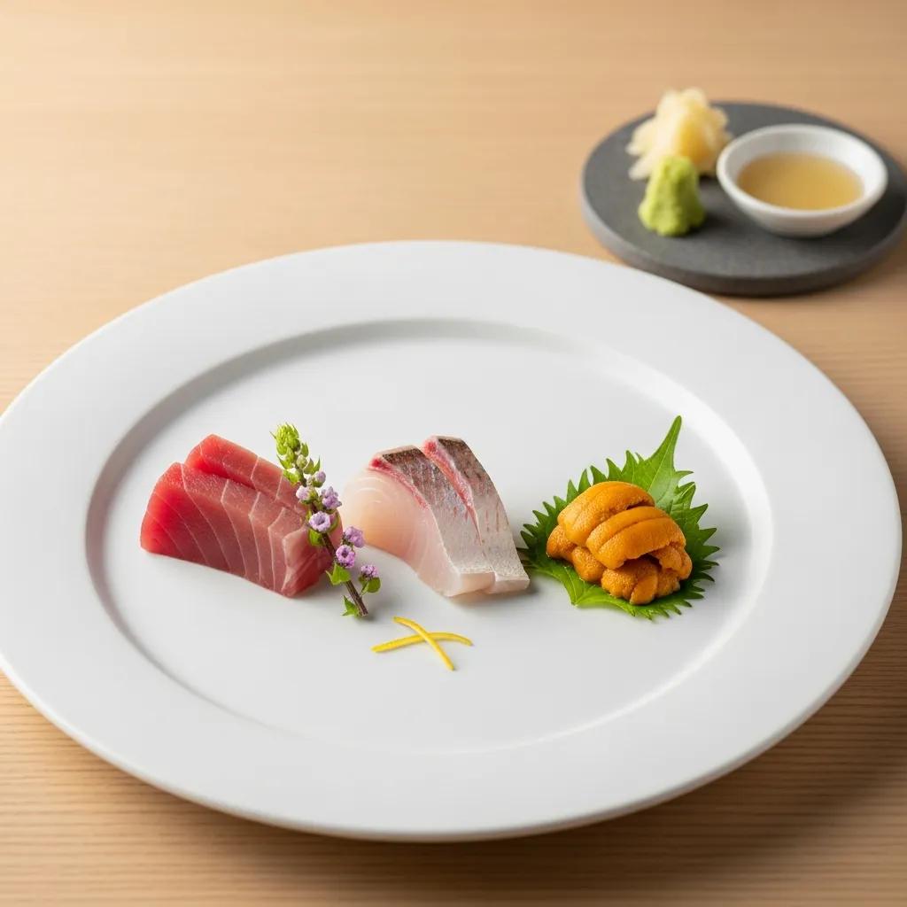
Japanese omakase privileges seasonal minimalism, thoughtful vessel choice, and an economy of garnish that foreground ingredient purity and revelation. Plating favors negative space and restrained palettes; the plate or bowl becomes a frame that complements rather than competes with the ingredient. Chefs choose vessels for texture and temperature—cool ceramic for sashimi, earthenware for grilled items—to signal context. Timing and sequence matter: each course is revealed in a measured progression so visual surprise and taste peaks align. These traditions show how restraint and attention to detail produce strong perceptual effects within a multisensory culinary story.
This Japanese aesthetic connects directly to broader gourmet plating strategies, which we explore next.
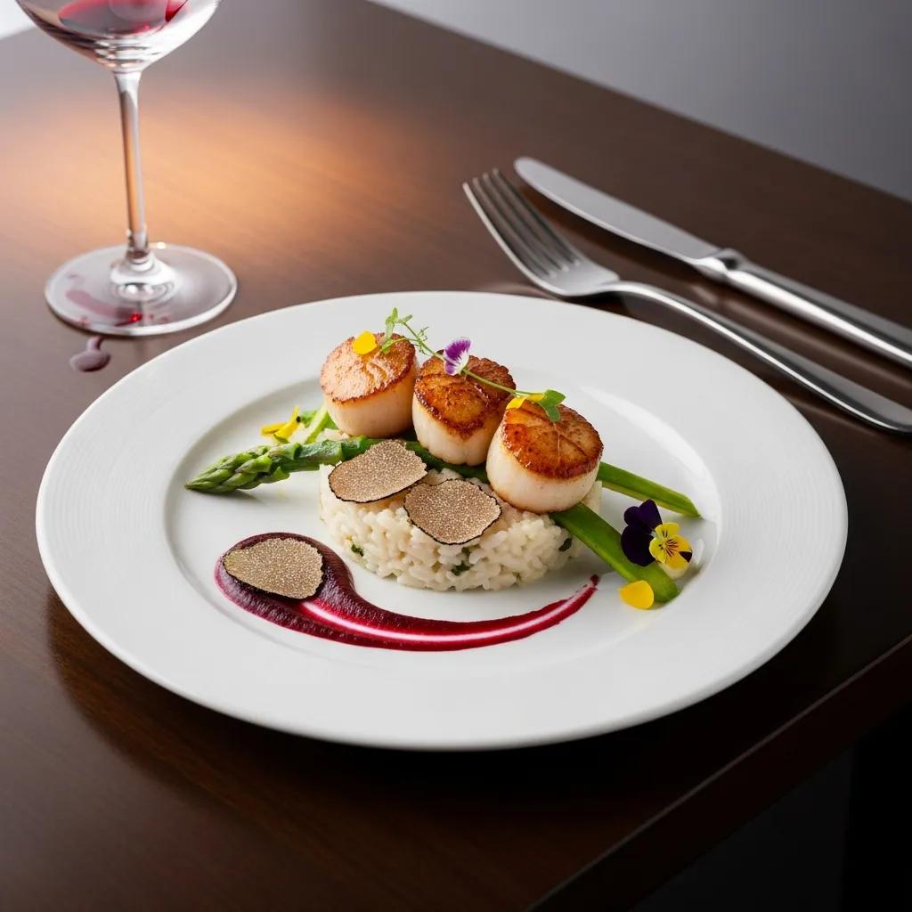
How Do Gourmet Plating Techniques Influence Dining Perception?
Gourmet techniques—precision cuts, micro‑garnishes, sauce strokes, and architectural stacking—convey technical mastery and elevate perceived complexity. Precision builds trust: meticulous placement suggests control and expertise, raising diners’ expectations of quality. Thoughtful novelty or theatrical reveals can increase perceived value but must remain coherent to avoid confusion. Generally, complexity raises perceived rarity and price; simplicity signals purity and ingredient focus. In short, plating choices shape not just flavor expectations but also social and economic perceptions—affecting overall satisfaction.
How Do Premium Ingredients Impact Food Presentation and Perception?
Premium ingredients bring distinct visual attributes—marbling, sheen, translucence, bead‑like textures—that act as immediate status signals and flavor predictors. These visual features create expectations of richness, umami, or brininess before tasting, and they interact with plating to amplify luxury. Below is a focused table contrasting visual attributes, perceptual effects, and serving tips to help maximize each ingredient’s visual impact, followed by practical examples from a Pasadena omakase kitchen.
High‑value ingredients communicate quality through visual cues; the table below shows how to present them for maximum effect.
This guide helps chefs identify how visual features create expectation and why minimal presentation often best showcases premium traits. These cues are visible in practice at high‑end kitchens.
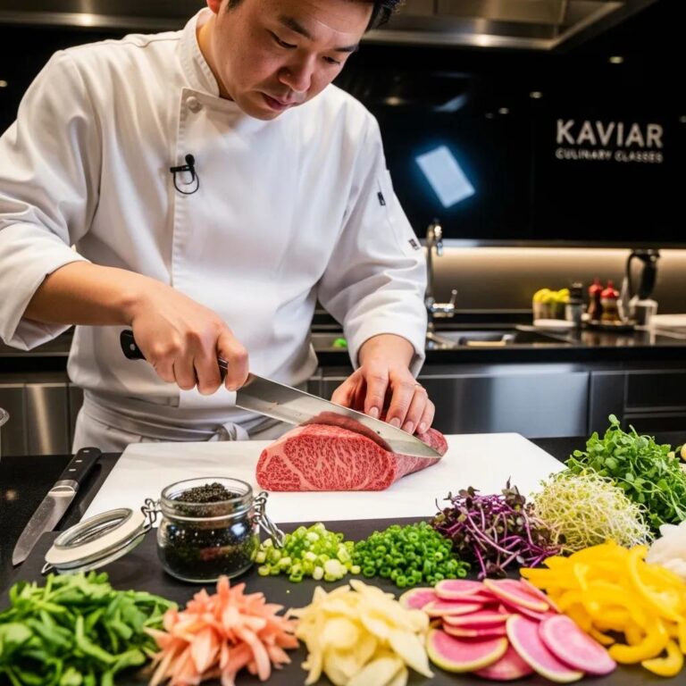
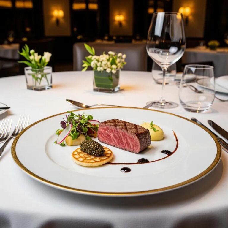
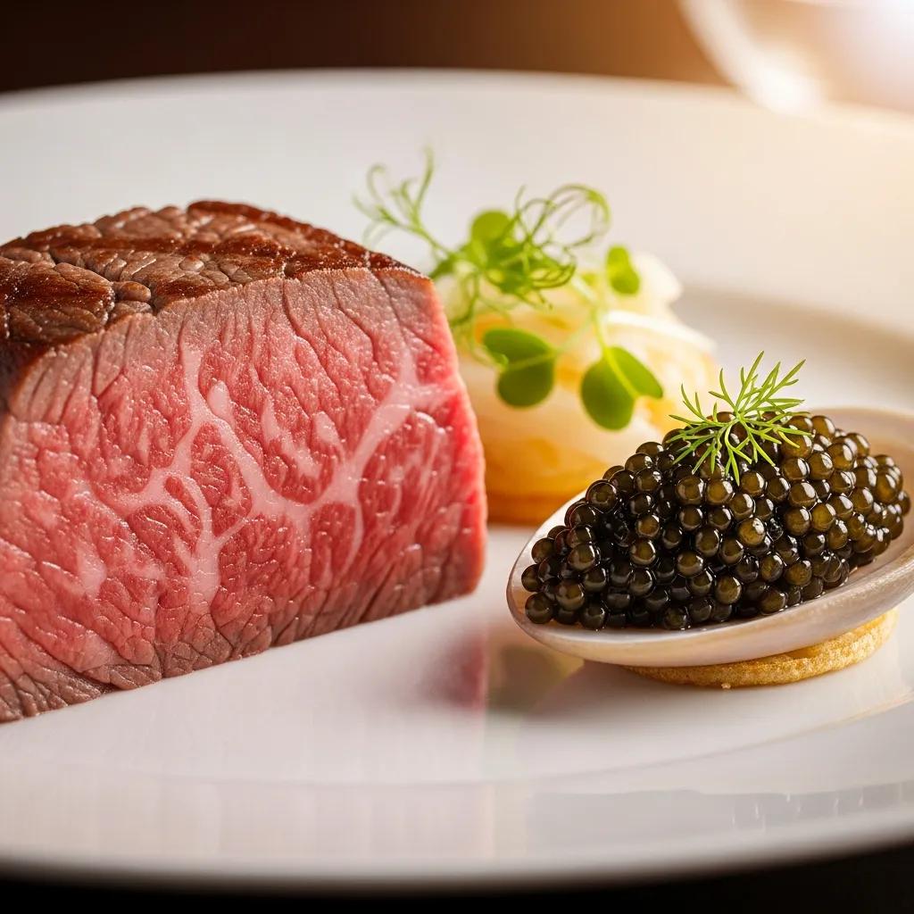
Figure caption / ALT text: “Close detail of thinly sliced A5 Wagyu highlighting marbling; plate kept minimal to accent sheen and texture — image credit: Kaviar Restaurant, Pasadena.”
At an upscale Japanese venue in Pasadena, chefs integrate A5 Wagyu and caviar into curated courses to create visual drama and directed taste expectation. Wagyu is sliced thin to reveal marbling; caviar is portioned sparingly on neutral carriers so its luster and bead structure read clearly. These presentation choices prime diners for perceived richness and exclusivity and are supported by reservation and service practices that match the elevated experience.
What Makes A5 Wagyu Visually Appealing?
A5 Wagyu’s appeal comes from intense intramuscular marbling and a glossy, translucent sheen that signal juiciness and richness. The lace‑like fat pattern reads as tenderness and depth, while the contrast of pale fat and rose meat suggests succulence. For plating, chefs slice Wagyu thinly to show marbling and keep garnishes spare so the meat remains the focal point. Modest height and restrained sauces emphasize purity and prime diners to expect concentrated flavor and enhanced mouthfeel. These visual cues shape impressions of richness long before the first bite.
Those Wagyu traits dovetail with how caviar functions visually on the plate.
How Does Caviar Enhance the Luxury Dining Experience Visually?
Caviar signals luxury through its bead‑like texture and reflective surface that catch light and draw attention to a small, precious portion. Against matte carriers—blini or chilled custard—its pearl‑like shine becomes an elegant focal point that reads as rare. Chefs portion caviar with exacting restraint, avoiding clutter so color and shine do the work. The small portion itself is a status cue: visually, a little goes a long way. As a finishing element, caviar raises perceived sophistication and heightens the overall luxury impression of a course.
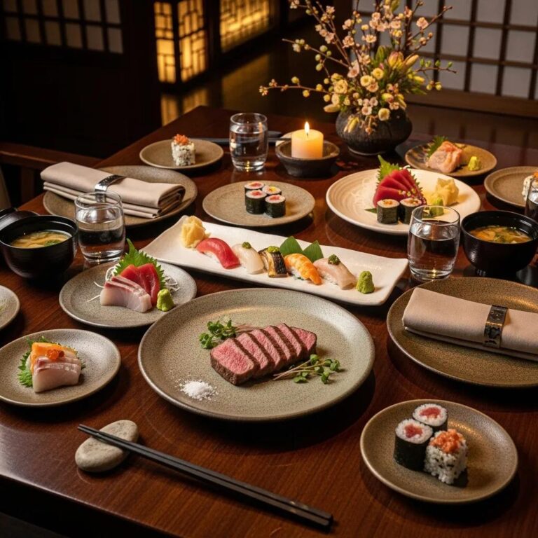
What Defines the Omakase Experience as an Artful Culinary Presentation?
Omakase is a chef‑led sequence that treats presentation as a narrative—timing, vessel choice, and plate‑by‑plate reveals shape guest perception. The structure relies on pacing: amuse‑bouche or small bites introduce themes, sashimi centers on purity, and cooked or fatty courses escalate richness so contrasts create tension and release. Artistry appears in vessel selection, restrained garnish, and the choreography between service and tasting; each element is a node in a larger sensory story. The table below maps typical omakase courses to presentation elements and guest goals, making the progression and its aims explicit.
Mapping omakase makes clear how presentation choices support narrative flow and guest expectation.
How Is Artistry Integrated into Every Plate at Kaviar?
At Kaviar, chef‑led artistry shows in careful vessel selection, restrained garnishing, and deliberate pacing that keep ingredient quality front and center within a sequential omakase flow. Plates are composed to highlight color, texture, and marbling with minimal distraction so each course reveals a distinct sensory facet and advances the meal’s story. Negative space and contrast focus attention; service timing makes each visual reveal coincide with peak tasting readiness. Guests therefore move through a considered progression where visual cues, aroma, and timing combine to elevate flavor and luxury. For reservations and menu details, Kaviar offers curated omakase services that reflect this artful approach.
This integrated artistry explains why diners choose omakase for a guided sensory journey.
Why Choose Omakase for a Multisensory Fine Dining Experience?
Omakase delivers a structured, multisensory sequence that values surprise, personalization, and chef interaction to deepen engagement and memory. Guests enjoy progressive contrasts—light to rich, cold to warm—that reveal subtle textures and seasonal ingredients. Personalization comes from chef adjustments for taste, allergies, or pacing, making each service unique. First‑time omakase diners should expect a multi‑course rhythm, thoughtful timing, and opportunities to speak with the chef about presentation and provenance. Choosing omakase is choosing a narrative dining experience where presentation, pacing, and interaction converge into a single elevated moment.
How Does Dining Ambiance and Reservation Process Influence Perception?
Ambiance and the reservation experience act as environmental and transactional cues that set expectations before the first course arrives; they can either reinforce or undermine the plate’s visual statements. Lighting, tableware, music, and service choreography interact with plating to reveal or obscure detail—warm directional light enhances gloss and color, while harsh overhead light flattens nuance. A seamless reservation flow and clear pre‑arrival communication reduce friction and prime guests for a high‑end experience. The checklist below outlines key ambiance and reservation UX factors that support perceived presentation and luxury, with a note on local considerations for Pasadena guests.
A focused checklist helps restaurants and diners align environment and booking practices to optimize perception.
- Lighting: Warm, directional accents bring out texture and sheen.
- Tableware: Choose surfaces that contrast with the ingredient to highlight color.
- Service Timing: Reveal plates so aroma and temperature match the tasting moment.
- Pre-arrival Communication: Confirm dietary notes and set expectations to reduce friction.
- Seating and Flow: Arrange seating so service choreography becomes part of the reveal.
These elements combine into a coherent pre‑ and in‑dining experience; below we connect them specifically to reservation UX.
What Role Does Ambiance Play in Enhancing Food Presentation?
Ambiance controls how visual details register by setting light temperature, surface reflectivity, and service proximity. Warm, slightly dimmed lighting with directional accents increases perceived gloss on proteins and helps micro‑garnishes read; cooler light can emphasize freshness in raw preparations. Tableware finish—matte or glossy—absorbs or reflects light and alters how color and texture are perceived. Service choreography, including how plates are presented and when the server speaks, adds narrative context that primes taste. Together, these elements either reinforce the plate’s intended message or create visual noise that diminishes it.
The interplay of ambiance and presentation leads naturally into reservation and booking considerations.
How Does a Seamless Reservation Process Contribute to Luxury Experience?
A frictionless reservation process sets positive expectations and lowers pre‑dining stress, increasing guests’ openness to the sensory experience on arrival. Clear confirmations, dietary preference collection, and pre‑arrival guidance let chefs plan presentation and timing that respect guest needs. Reservation UX thus becomes part of service design: personalization at booking enables tailored courses, and timely communication signals professionalism and trust. An upscale Pasadena restaurant that pairs refined ambiance with a smooth booking flow reinforces its luxury promise—making the visual presentation and service feel cohesive and intentional. Guests seeking curated omakase are encouraged to reserve in advance to secure a thoughtfully staged journey.
Frequently Asked Questions
What are some common mistakes in food presentation that can negatively impact perception?
Common missteps include overcrowding the plate, clashing colors, and ignoring negative space. Overcrowding hides the main component and confuses the eye; poor color choices can fail to convey the intended emotion; neglecting plate shape and scale creates imbalance. To avoid these errors, focus on clarity, contrast, and intentional placement so each element supports the dish’s story.
How can home cooks apply fine dining plating techniques?
Home cooks can borrow fine‑dining principles by embracing simplicity, balance, and thoughtful arrangement. Start with a clean, attractive plate and consider color contrast. Use negative space to let the main ingredient breathe, experiment with modest layering for height, and add garnishes that complement flavor. Take a moment to arrange each bite—small choices make a big visual difference.
What role does cultural context play in food presentation?
Cultural context shapes aesthetic values and presentation conventions. Japanese omakase favors seasonality and restraint; French cuisine may celebrate elaborate garnishes and polish. Respecting these traditions helps chefs create dishes that meet diners’ expectations and feel authentic. Incorporating cultural cues—ingredients, vessels, or plating rhythm—deepens the connection between dish and story.
How does the choice of tableware affect food presentation?
Tableware influences how food reads: material, color, and texture change perceived contrast and mood. A matte plate can mute reflections and make colors pop; a glossy surface enhances sheen. Plate shape and scale guide arrangement and the diner’s eye. Selecting the right vessel is a deliberate design choice that completes the plate’s message.
What are some tips for photographing plated dishes effectively?
For compelling food photos, prioritize light, angle, and composition. Natural, diffuse light preserves color and texture; try overhead and 45° angles to find the most flattering view. Use a simple background to keep focus on the dish, apply the rule of thirds for balance, and shoot multiple frames to capture the best moment. Small styling tweaks—wiping edges, adjusting garnish—translate well on camera.
How can chefs use storytelling in food presentation?
Chefs tell stories by arranging ingredients to reflect seasonality, provenance, or a concept. Thoughtful plating that highlights local sourcing or a dish’s origin creates emotional context. Visual cues—color, vessel, and sequence—can evoke memory or place. When storytelling is aligned with flavor, it deepens the diner’s connection and makes the meal more memorable.
Conclusion
Mastering presentation changes how a meal is perceived—shaping impressions of flavor, quality, and value. By applying deliberate plating techniques and understanding the psychology of visual cues, chefs craft memorable culinary narratives that resonate. Whether at home or in a fine‑dining omakase, thoughtful plating elevates the experience. Explore our curated dining offerings and let presentation transform your next meal.