


The Art of Plating: Mastering Fine‑Dining Techniques for Elevated Presentation
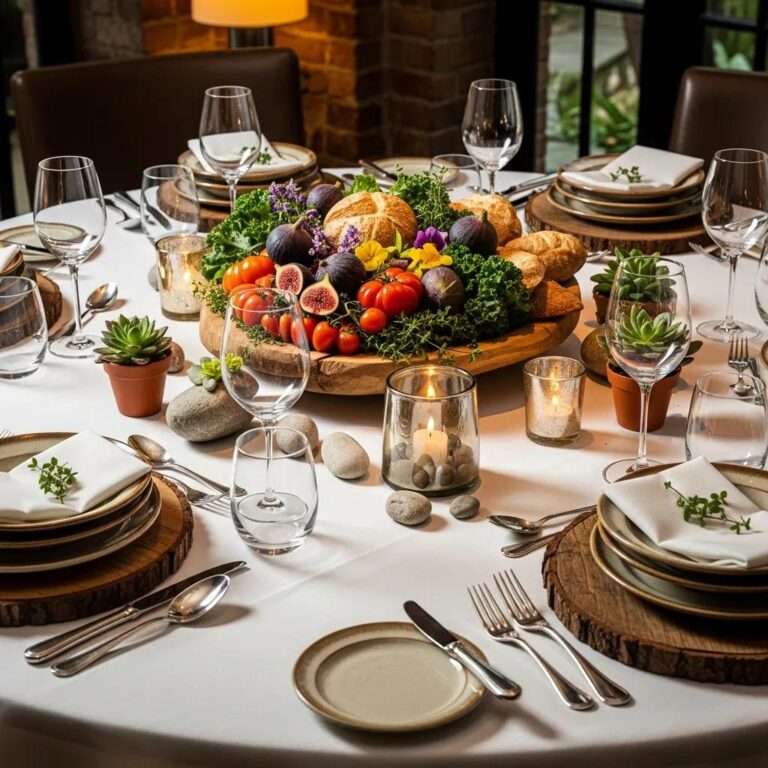
Plating is a visual language: it translates taste, texture and technique into a moment that lingers. This guide lays out the foundational rules behind thoughtful dish design, the tools chefs rely on, and the contemporary directions shaping plating in fine dining and omakase. Many cooks find their arrangements feel accidental rather than purposeful—here we make those choices explicit. Expect clear definitions, step‑by‑step methods, and concrete examples that show why balance, negative space, color, and height matter. We’ll trace how Japanese restraint and precision inform modern plating, survey trends like vertical layering and sustainable serviceware, and offer chef‑tested tools and home exercises so you can refine your styling or better read a plate in a fine‑dining setting.
What Are the Core Principles of Culinary Presentation in Fine Dining?
Presentation is the intentional placement of elements so the plate communicates flavour priorities, texture contrasts and portion hierarchy. Professional plating rests on six interconnected principles—balance, focal point, negative space, color contrast, texture contrast and height—that together shape a coherent visual story and guide the diner’s eye and palate. Apply these principles and you raise perceived quality, clarify portions and transform a dish from course to narrative. Below we outline how balance and focal points direct composition, then why negative space and color are essential for refinement and appetite appeal.
Each plating element contributes a distinct sensory effect:
- Balance: Even distribution of visual weight makes a plate read as intentional and composed.
- Focal point: A defined anchor—usually the protein or a bold garnish—directs where to begin tasting.
- Negative space: Deliberate emptiness frames components and elevates refinement.
- Color contrast: Complementary or contrasting hues heighten perceived freshness and flavor.
- Texture contrast: Combining soft, crunchy and silky elements enriches mouthfeel.
- Height: Vertical layers introduce drama and clarify component hierarchy.
These principles act together to form a unified composition; once you understand balance, directing the eye with a clear focal point becomes intuitive.
Use this table as a quick reference: mastering each element helps you design plates that read as purposeful and sensory‑driven.
How Do Balance and Focal Points Enhance Food Aesthetics?
Balance in plating means no single area overwhelms another; it aligns visual weight with the order you want the diner to taste. Symmetry feels formal and composed; asymmetry creates motion and modernity—both are valid when a focal point remains legible. The focal point, often the protein or a vivid garnish, acts as a visual anchor and signals where the tasting should start. Chefs control scale, color saturation and placement (think rule of thirds) to make that anchor immediately clear. Once you see how balance and focal point interact, arranging sides, sauces and garnishes so they support—not compete with—the main element becomes straightforward.
Why Are Negative Space and Color Contrast Essential?
Negative space is a framing device: empty plate area reduces clutter, lets the eye rest and magnifies delicate elements. A lone sashimi slice or a single quenelle surrounded by space gains presence and suggests restraint—an idea central to fine dining and many Japanese aesthetics. Color contrast uses complementary or opposing hues to intensify perceived freshness—bright herbs against caramelized protein, vivid roe on pale rice. The right plateware enhances these contrasts, while thoughtful negative space prevents visual overload and signals refinement to the guest.
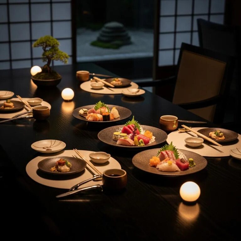
How Does Japanese Cuisine Influence Artful Food Plating at Kaviar Restaurant?
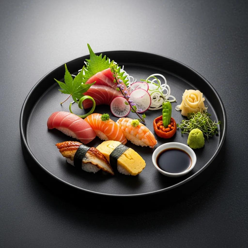
Japanese cuisine contributes three guiding principles—precision, seasonality and minimalism—and these shape Kaviar’s approach to plating by letting ingredients speak with minimal ornament. That philosophy emphasizes proportion, exact knife work and rhythm across courses, much like an omakase sequence where each plate is a step in a curated progression. At Kaviar, chefs apply these aesthetics to seasonal produce, sushi and signature items—A5 Wagyu and Kaluga caviar—using restraint and exacting technique so premium ingredients remain the focal point. This discipline governs everything from nigiri placement to the pared‑back accoutrements in a caviar service, and it shapes how diners perceive texture and flavor transitions during an omakase.
Japanese plating favors natural forms and seasonal cues; here are common methods you’ll encounter in omakase presentations—either to try at home or to look for when dining.
- Minimal Garnishing: Add only what enhances flavor or color without masking the main ingredient.
- Intentional Slicing: Precise knife work optimizes texture and the ideal bite size.
- Natural Forms: Arrange components to echo seasonal shapes—petals, leaves or waves.
- Course Rhythm: Move from delicate to robust to guide palate development.
These techniques make presentation and taste inseparable; the examples below show how they appear across omakase courses.
What Are the Signature Japanese Plating Techniques Used in Omakase?
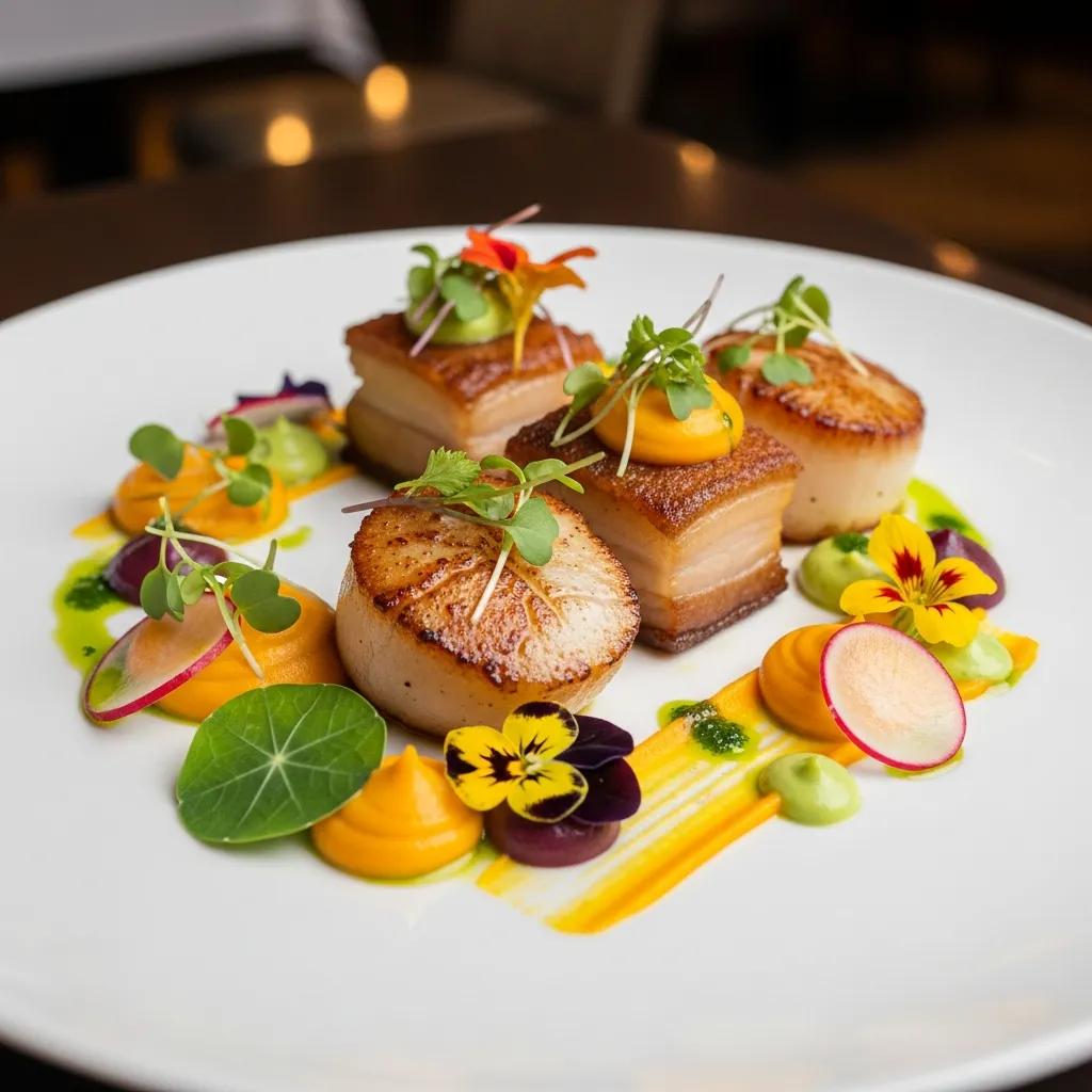
Omakase plating prioritizes the ingredient’s texture and seasonality: clean cuts, spare garnishes and deliberate spatial rhythm. Chefs apply precise knife angles and carefully controlled portions so each bite delivers the intended balance of rice, fish and seasoning. Plating often mirrors nature—small clusters suggest a landscape or seasonal motif—deepening the sensory narrative and anchoring the sense of place. Simple accents, a shiso leaf, a micro‑herb or a delicate brush of sauce provide contrast without overwhelming, keeping the focus on purity and mouthfeel.
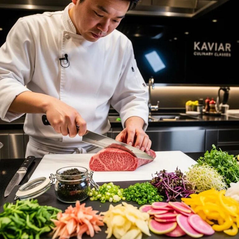
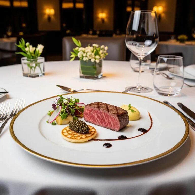
How Do Precision and Minimalism Elevate A5 Wagyu and Caviar Presentation?
For luxury ingredients, restraint is a virtue: precision removes distraction and lets superior quality define the experience. With A5 Wagyu, measured portions and passive plating—thin slices or a small tartare quenelle—allow the fat to render and the texture to shine. Caviar is presented with neutral carriers and a single accent so its briny pop remains front and center. Alt text for photography should highlight texture and focal attributes—for example, “A5 Wagyu tartare: ribboned marbling with microgreen”—to support accessibility and accurate visual indexing.
Which Modern Food Plating Trends Define Elevated Presentation in 2025?
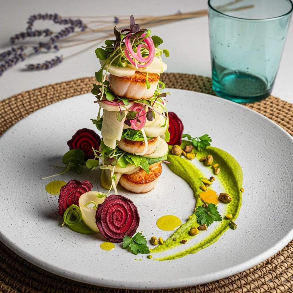
In 2025 plating blends classic restraint with experimental form. Minimalism still anchors the aesthetic, while vertical layering, sustainable serviceware and interactive finishes are increasingly common. Chefs build height for sculptural effect, use edible vessels or compostable materials to reduce waste, and introduce tableside elements that finish a dish visually and aromatically. These trends reflect guests’ appetite for both theatre and responsible sourcing, so elevated presentation now balances spectacle with stewardship. Below we unpack how minimalism, vertical techniques and sustainability shape contemporary plates.
- Sculptural Height: Vertical layers add drama and separate textures.
- Sustainable Serviceware: Reusable or compostable vessels reduce waste and reflect sourcing ethics.
- Interactive Elements: Tableside finishes or reveal moments engage sight and scent.
- Minimal Color Palettes: Limited hues create refined, gallery‑like plates.
- Textural Focus: Crisp, silky and gel textures combined for multisensory contrast.
These trends influence not only a dish’s look but how it’s prepared and served, guiding ingredient choices and plating technique.
How Are Minimalism and Vertical Layering Applied in Contemporary Plating?
Minimalism reveals an ingredient’s essence by removing excess; vertical layering adds depth without crowding the surface. Chefs build height with stackable elements—crisps, layered vegetables or ring‑molded components—anchored to a central protein that remains the focal point. A restrained palette plus strategic height sharpens textural contrasts as diners move from top to base. When using height, chefs plan stability and serviceability so the structure survives the pass and the journey to table.
What Role Do Sustainable and Interactive Plating Practices Play?
Sustainable plating aligns aesthetics with responsibility—compostable garnishes, edible vessels and reduced single‑use items signal ethical intent. Interactive plating—tableside sauces, aromatic finishes, a final torch—creates ritual and memory while underscoring freshness and technique at service. Both approaches require operational adjustments: sustainable pieces must withstand heat and handling, and interactive elements need precise timing to preserve texture and aroma. Thoughtful integration enhances the guest experience while supporting kitchen flow and brand values.
What Tools and Techniques Do Professional Chefs Use for Food Styling?
Chefs and food stylists keep a compact kit and a set of repeatable techniques to achieve precision and consistency. The right tools enable exact placement, clean lines and controlled portions. Mastery of tweezers, ring molds, squeeze bottles, offset spoons and a microplane lets teams place sauces, garnishes and shavings intentionally and hygienically. Techniques—sauce swipes, dotting, quenelles and crisp placement—translate concept into plates that travel from pass to guest. The table below outlines common implements, their use cases and the outcomes they produce.
Choosing a minimal, well‑kept kit makes precision achievable and consistent in service.
Which Essential Plating Tools Enhance Precision and Detail?
Tweezers, squeeze bottles, ring molds, offset spoons and a microplane form a compact, professional set. Tweezers place fragile garnishes without damage; squeeze bottles allow controlled dots, swirls and lines; ring molds create clean edges and reliable height; offset spoons make smooth sauce swipes. Care—clean immediately, dry thoroughly and replace worn tips—keeps these tools sanitary and service‑ready even under pressure.
How Are Sauces, Garnishes, and Textures Artfully Applied?
Apply sauces with intent: swipes create movement, dots set rhythm, pools provide a flavour bed for proteins. Choose garnishes for texture or taste—crisps for crunch, microgreens for freshness, a restrained dusting of citrus or roe for salinity—avoid decoration for its own sake. Build textural layers by combining purées, gels and crisp elements so each bite includes at least two contrasting sensations. A practical rule: plan one dominant texture, one supporting texture and one contrasting pop to keep balance and clarity on the plate.
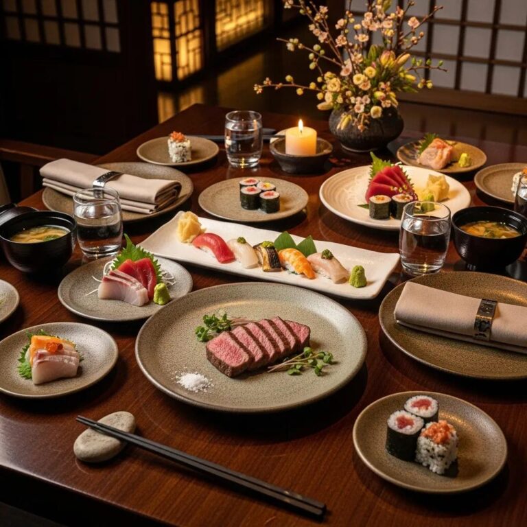
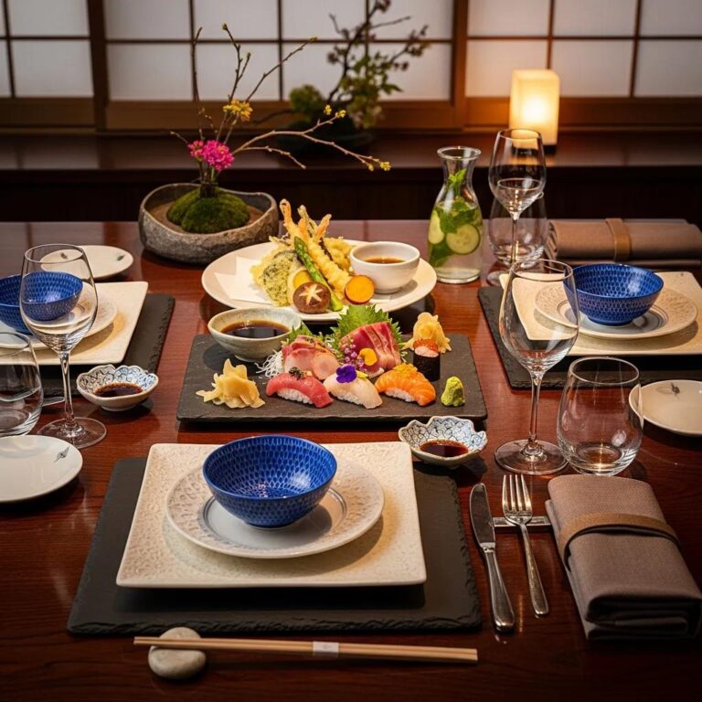
How Does Kaviar Restaurant Create a Luxury Dining Experience Through Presentation?
At Kaviar, plating, premium ingredients and attentive service form a purposeful sensory arc grounded in Japanese technique and fine‑dining polish. Presentation emphasizes ingredient‑first restraint—showing A5 Wagyu’s marbling, Kaluga caviar’s sheen, and the visual cadence of omakase courses—so each plate reads as both art and promise. Service sequencing guides guests from light starters to richer mains, with plating cues that signal tasting order and pace. To experience these presentations in person, Kaviar accepts reservations by phone and on major platforms such as Resy and OpenTable; our tasting menus and signature services are designed to showcase these presentation principles.
These spotlights reflect Kaviar’s approach: economy of portion, visual clarity and ingredient‑forward plating that respects the luxury of A5 Wagyu and Kaluga caviar.
What Is the Role of Premium Ingredients Like A5 Wagyu and Kaluga Caviar?
Premium ingredients demand precision and restraint. Their flavour and texture speak for themselves, so adornment is minimal. A5 Wagyu is portioned and plated to highlight marbling and mouthfeel—often in restrained cuts or a small tartare to show sheen and layering. Kaluga caviar sits on a neutral carrier with a single accent so the pop and salinity remain the focus. For editorial or menu photography, alt text should call out texture and the focal attributes (for example, “Kaluga caviar on neutral blini with citrus zest”) to set sensory expectations and improve visual discoverability.
How Does Culinary Presentation Complement the Sensory Journey of Omakase?
Omakase presentation is sequenced to lead the diner from delicate to robust using composition, color and portion cadence as visual cues. Pale, spare plates usually precede richer, deeper courses; small plates early, larger plates later—this visual rhythm manages appetite and excitement. Tactile contrasts between courses reset the palate for what follows. A clean swipe or a single herb signals a moment to pause and appreciate nuance, while richer concentrations prepare the diner for bolder textures. The result is a progressing narrative rather than disconnected dishes.
This intentional sequencing is the backbone of a memorable omakase.
How Can You Elevate Your Own Culinary Presentation Inspired by Kaviar’s Techniques?
You can bring professional plating principles into your kitchen by prioritizing three things: ingredient quality, deliberate composition and a small, reliable toolset. Practice drills—plate one protein three ways, make sauce swipes, build a simple vertical stack—improve visual literacy and hand control. Inexpensive substitutions work: tweezers can be replaced by clean chopsticks. Start with a squeeze bottle, spoons, a ring mold and a microplane.
- Five Practice Exercises: Plate one protein three ways; execute three sauce swipes; assemble a two‑layer vertical stack; compose four color‑contrast pairings; practice micro‑garnish placement.
- Starter Tool Kit: Tweezers (or chopsticks), squeeze bottle, ring mold, offset spoon.
- Quick Checklist: Pick a focal point, limit components to three, use negative space, finish with a textural contrast.
These focused steps build repeatable skills; below we outline which principles and tools to prioritize for beginners and how to apply them in everyday cooking.
What Are Practical Tips for Home Chefs to Master Food Plating?
Begin by simplifying: choose one focal element per plate, limit garnishes to items that add flavor or texture, and select plates that complement your food’s color palette. Mise‑en‑place matters—fill squeeze bottles, portion proteins with a ring mold and keep a clean surface to avoid smudges. Practice a few techniques daily—sauce swipes, dotting and quenelle formation—to develop muscle memory and timing, especially when plating hot proteins. Photograph your plates from several angles to evaluate balance and iterate; visual feedback accelerates improvement.
Which Plating Principles and Tools Can Beginners Apply Easily?
Start with three core principles: use negative space to prevent clutter, set a single focal point, and include at least one textural contrast per plate. A modest toolset—tweezers or chopsticks, a squeeze bottle, a ring mold and an offset spoon—covers most foundational techniques without a big investment. Simple templates—”protein center + sauce swipe + crunchy garnish” or “protein at rule‑of‑thirds + small side + microgreen”—make plating approachable for weeknight cooking. With repetition your plating will move from technical to expressive, reflecting professional methods used in luxury kitchens.
(This article ends after the last provided heading.)
Frequently Asked Questions
What are some common mistakes to avoid in food plating?
Common missteps include overcrowding the plate, ignoring negative space and mixing too many conflicting colors or textures. Overcrowding reads as cluttered and accidental; lacking negative space overwhelms the eye. Without a clear focal point, diners won’t know where to begin. Keep compositions simple and purposeful so each element earns its place.
How can I practice food plating at home without professional tools?
You can improve at home with everyday items: chopsticks work as tweezers, and a clean condiment bottle can act as a squeeze bottle. Focus on simple exercises—arrange a single protein with a sauce swipe or stack vegetables vertically. Use plates with contrasting colors to boost visual impact. Regular practice with these makeshift tools develops steadiness and eye for detail.
What role does lighting play in food presentation?
Lighting changes how color and texture read. Natural light usually renders colors truest and creates soft shadows that add depth. Avoid harsh overhead lights that flatten tones or produce glare. For photos, use diffused light or a softbox to achieve even, appetizing illumination that makes food look fresh and inviting.
How do I choose the right plate for my dish?
Choose a plate that complements the dish’s colors and portion. White plates are versatile and let vibrant hues pop; darker plates add drama for lighter foods. Match plate size to portion—an oversized plate can make a small portion look sparse, while a too‑small plate can feel cramped. The goal is to support the food without competing with it.
What are some tips for creating height in food plating?
Create height by layering and stacking: use ring molds for stable layers of grains, proteins and vegetables. Add vertical accents—crispy shards or microgreens—to draw the eye upward. Anchoring the structure with a base of sauce or purée helps stability. Height adds visual interest and invites diners to explore different textures.
How can I incorporate seasonal ingredients into my plating?
Use seasonal produce to enhance freshness and visual appeal. Select ingredients at peak ripeness and arrange them to showcase their natural shape and color, using minimal garnishes and intentional slicing. Consider how seasonal hues contrast or harmonize on the plate—this connects the dish to time and place while lifting its aesthetics.
What is the importance of texture in food plating?
Texture is central to enjoyment. Combining creamy, crunchy and silky elements creates a more engaging mouthfeel and elevates a dish. When plating, ensure each component contributes to textural balance—pair a soft purée with a crisp element, for example—and arrange components so that contrasting textures are apparent in each bite.
Conclusion
Plating transforms food from nourishment into experience. By applying principles like balance, negative space and color contrast you can create plates that tell a story and showcase your ingredients. Bring these techniques into your kitchen and watch everyday meals become more considered and memorable. Begin your plating practice today—explore our resources and tools built for home chefs and aspiring professionals alike.