


Mastering Culinary Presentation: Fine‑Dining Plating Techniques and Elevated Food Styling
Plating is a practiced language: arranging color, texture and form so a dish makes an immediate visual and sensory promise before the first bite. This guide unpacks how plate choice, layered textures, color contrast and measured height combine to turn ingredients into composed dishes — from classical fine dining to contemporary Japanese omakase. Many kitchens struggle to turn stylistic ideas into repeatable, service‑ready systems; here you’ll find clear principles, specific Japanese influences, ingredient‑forward approaches for A5 Wagyu and caviar, and pragmatic chef workflows. We cover the fundamentals (balance, focal point, negative space), cultural aesthetics (Wabi‑Sabi, seasonality), luxury handling (Miyazaki A5 Wagyu, Kaluga caviar), dinnerware decisions, and the training needed to deliver consistent visual narratives. Each section pairs definitions with concrete examples so you can apply these methods in restaurant service, food photography, or at home for a more considered plate.
What Are the Key Principles of Fine Dining Plating Techniques?
Great plating rests on a few repeatable principles — balance, a clear focal point, intentional negative space, color contrast, layered textures and controlled height. Together they guide where the eye lands and influence how flavors are perceived. Balance controls visual weight through symmetry or purposeful asymmetry; focal points celebrate the star ingredient; negative space frames that star and signals restraint; color and texture create sensory depth. When applied consistently, these rules let chefs build reliable, camera‑ready presentations that suit both omakase service and multi‑course tasting menus. Below is a concise list to use while plating.
Fine dining plating is governed by six concise rules:
- Balance: Evenly distributing color, volume and visual weight across the plate.
- Focal Point: One standout element that anchors the composition and draws the eye.
- Negative Space: Deliberate empty areas that isolate the focal element and convey refinement.
- Color Contrast: Pairing hues to enhance vibrancy and make components readable.
- Texture Layering: Mixing soft, crisp and silky elements for tactile interest.
- Height and Movement: Vertical accents and directional lines that introduce drama and flow.
Use these rules as a checklist during service. Consistent mise en place, portioning guidelines and small experiments — change one garnish, one smear, or one placement at a time — will show you what truly shifts the plate’s impact.
The following table maps each principle to a practical technique you can use immediately in service, providing a compact reference for routine plating decisions.
Standardizing these techniques reduces variability between covers. From here, the same principles are reframed through Japanese presentation aesthetics, which emphasize restraint and seasonality.
How Do Balance and Harmony Enhance Culinary Presentation?
Balance in plating is both visual and gastronomic: portions, intensity and mouthfeel must work together so each bite feels complete. Visually, balance can be classical and symmetric or modern and asymmetric; on the palate it means fat, acid and texture support one another rather than clash. Chefs confirm harmony by tasting components together and adjusting seasoning or portions to keep any single element from dominating. For example, an omakase course might pair a rich toro morsel with a bright citrus gel and crisp microgreens to counterweight fat with acidity. Achieving this requires portion control, repeatable garnish placement and a working knowledge of how ingredients interact in the mouth.
To make balance reliable in service, use clear plating templates and calibrations — target weight per portion, height limits and garnish sizes — so line cooks can reproduce the chef’s intent consistently across covers.
Why Are Focal Point and Negative Space Essential in Plate Design?
A defined focal point gives the diner a single visual anchor that communicates the dish’s priority; negative space frames that anchor and signals refinement. Highlighting a focal element — a seared scallop or a slice of Miyazaki A5 Wagyu — and arranging supporting pieces to lead the eye toward it creates clarity. Negative space prevents clutter and implies confidence; generous plate margins are a common luxury cue. In practice, chefs use tweezers for micro‑garnishes and squeeze bottles for dots or smears, forming gentle directional lines that guide attention without crowding the plate.
Once the star is chosen, every other component should support it by contrast, texture or color — a simple rule that simplifies plating choices and strengthens the dish’s message.
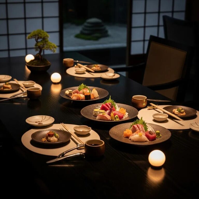
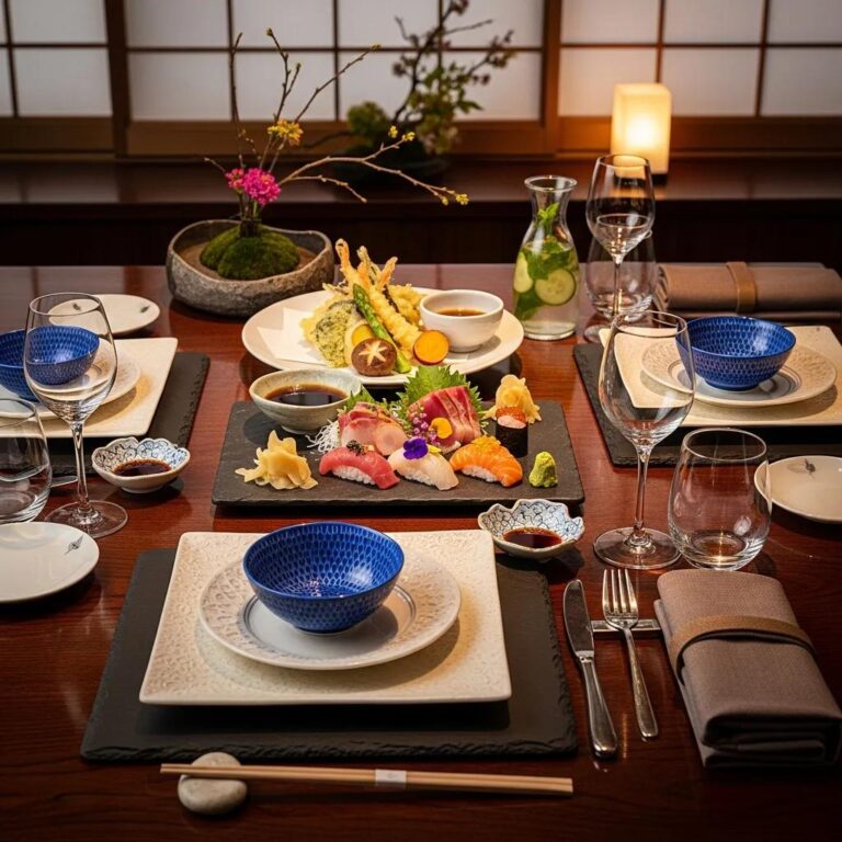
How Does Japanese Food Presentation Influence Luxury Restaurant Plating?

Japanese presentation brings a disciplined minimalism, seasonality and quiet storytelling to luxury plating. Wabi‑Sabi values natural forms and imperfection, encouraging compositions that feel organic rather than overworked; omakase practices present a sequence of focused, single‑ingredient bites. Seasonality guides ingredient and garnish choices, shaping color, aroma and narrative so courses feel cohesive. These ideas translate into modern luxury plating by favoring restraint, precise portioning and an emphasis on ingredient integrity over heavy ornamentation.
In haute contexts, chefs adapt these principles to spotlight premium items: an omakase plate might show a single slice of toro or uni with a minimal accent to highlight texture and provenance. Kaviar Restaurant applies this logic, centering courses on ingredients like Miyazaki A5 Wagyu and Kaluga caviar and using simple, seasonal accents to amplify flavor while preserving visual purity.
Below is a short list of traditional Japanese garnishes and their visual and sensory roles.
- Shiso leaf: Bright green contrast and aromatic lift for fatty fish.
- Yuzu zest: Clean citrus brightness and a pale highlight for balance.
- Sansho pepper: Dusty green note with subtle speckling.
- Pickled ginger: Palate cleanser that introduces soft pink or white contrast.
These garnishes add contrast, seasonality and aroma without obscuring the primary ingredient. Applied with restraint, they elevate luxury plating by ensuring every accent has purpose.
What Is the Role of Wabi‑Sabi and Minimalism in Japanese Plating?
Wabi‑Sabi celebrates impermanence, asymmetry and the beauty of natural forms — values that lead chefs to present food with quiet restraint and refined simplicity. Minimalism pares elements back so the ingredient’s texture, color and aroma take center stage. A Wabi‑Sabi plate might use a rough ceramic, a single brush of sauce and a small seasonal accent, creating an intimate link between food and vessel. The result is sensory clarity that feels both honest and elegant.
Adopting this approach requires discipline: every garnish must justify itself with scent, flavor or contrast, otherwise it’s omitted. This economy of means yields memorable, authentic presentations.
How Are Seasonal Ingredients and Traditional Garnishes Used in Japanese Fine Dining?
Seasonality directs ingredient selection and the visual language of Japanese fine dining. Delicate spring blossoms, autumn citrus peels or winter root slices act as small, precise punctuation marks — visual and aromatic cues that enhance a dish’s narrative. Menus rotate with the seasons, so plating palettes and garnish styles evolve over the year, rewarding repeat guests with subtle differences. Seasonal choices also influence temperature and texture — cool citrus gels for summer, warm reductions for winter — reinforcing how presentation and sensory elements are stitched together.
These seasonal accents are typically small, precisely cut and purposeful, adding context rather than decoration.
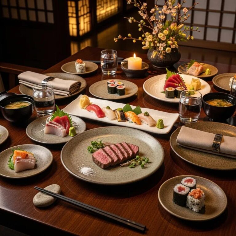
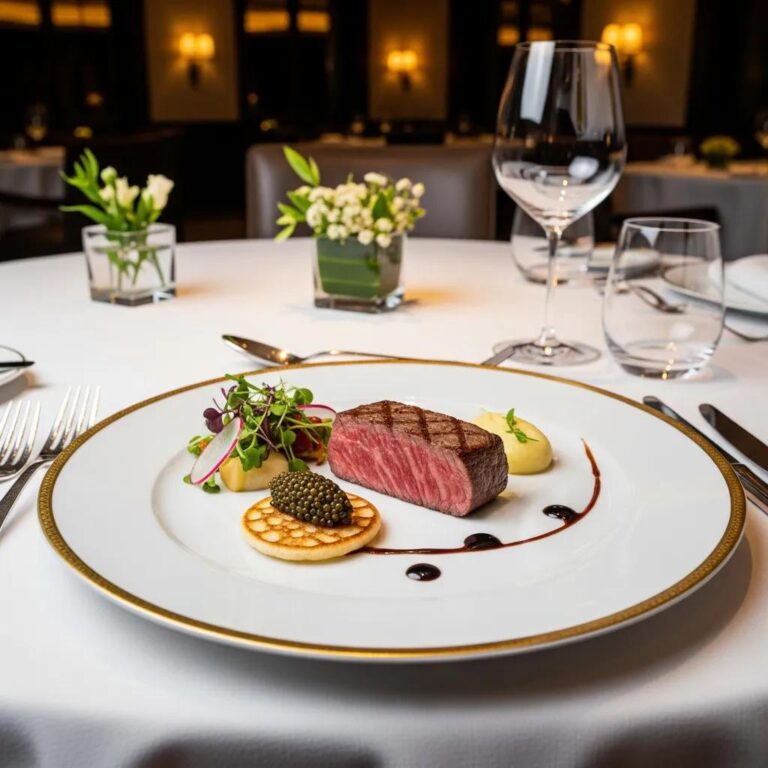
What Are Elegant Food Plating Ideas Using Premium Ingredients Like A5 Wagyu and Caviar?

Premium items like Miyazaki A5 Wagyu and Kaluga caviar call for restrained, precise presentation that highlights provenance, texture and richness. For A5 Wagyu, celebrate marbling with minimal garnishes, delicate seasoning and exact temperature control to preserve mouthfeel. For caviar, choose delicate vessels and neutral surfaces so the pearls’ texture and brine are front and center. Ingredient‑specific plating reconciles portioning, visual hierarchy and accompaniments so the luxury element remains the unambiguous focal point. The table below compares how presentation attributes differ between these two ingredients.
This comparison shows Wagyu benefits from warmth and contrast, while caviar demands cool, delicate handling. Applying these distinctions to plate layouts produces elegant, ingredient‑forward presentations suited to luxury service.
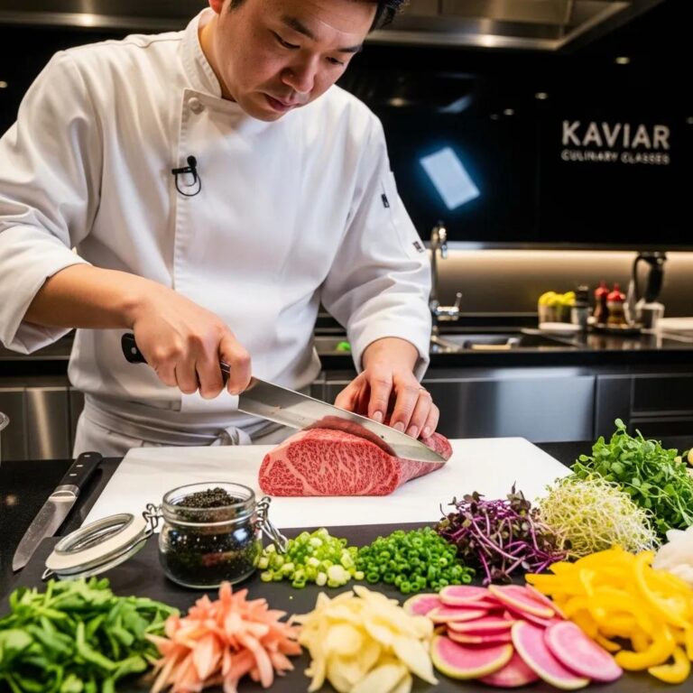
How Is A5 Wagyu Artfully Presented to Elevate Visual Appeal?
Present A5 Wagyu with restraint so its marbling and succulence remain the focal point. Chefs portion the cut into small, intentional servings and use minimal finishing — often only a flake of finishing salt — so texture and flavor shine. Choose dark, matte plates to amplify the meat’s sheen and create contrast; balance with a small vegetable accent or a controlled smear of umami reduction without distracting from the meat. Temperature control is essential: rest briefly after searing so juices settle, then serve warm. Tweezers help place micro‑garnishes and finishing salts precisely for repeatability.
These choices produce a refined focal moment that invites visual appreciation before the first bite.
What Are the Best Practices for Caviar Service Artistry and Delicate Garnishing?
Caviar plating is about delicate handling, neutral vessels and sparing garnishes to protect pearl texture and saline clarity. Serve chilled in a shallow, non‑metallic bowl — mother‑of‑pearl spoons preserve flavor while glass or neutral ceramic showcases color. Keep accompaniments light and unobtrusive: thin blini, tiny toast points, blanched root discs and delicate microherbs. Small accents like edible gold leaf or a single microgreen add drama without competing. Timing matters — present caviar immediately after opening and avoid heavy sauces or strong citrus that mask its subtle brine.
These practices safeguard caviar’s sensory integrity and produce an elegant, considered service appropriate for luxury dining.
How Can Chefs Master Culinary Presentation Artistry at Kaviar Restaurant?
Mastery in a professional kitchen combines philosophy, technique and disciplined training — the same mix Kaviar brings to its Japanese‑inspired fine dining and omakase. We prioritize premium ingredients, meticulous prep and visual storytelling in every course. Chefs train with standardized plating templates, timed stations and precision tools so each plate meets the restaurant’s aesthetic and flavor standards. This operational rigor aligns creative intent with service realities, allowing complex multi‑course presentations to be delivered consistently during busy seatings.
Kaviar’s approach shows how plating theory becomes daily practice: clear templates, focused training and an ingredient‑forward mindset ensure each dish communicates visually and gastronomically.
Below is a practical list of essential plating tools and how they support consistent presentation.
- Tweezers: Position micro‑garnishes and delicate elements precisely without bruising.
- Squeeze bottles: Control sauce placement to create consistent dots, lines or smears.
- Ring molds and tongs: Shape proteins and stacks to manage height and silhouette.
- Microplane and finishing spoons: Apply zest or finishing salts in measured, repeatable amounts.
What Is Kaviar’s Philosophy Behind Artistic Food Presentation?
Kaviar’s plating philosophy is simple: highlight premium ingredients through thoughtful restraint, seasonality and Japanese‑inspired minimalism. We center high‑impact focal points — a single Toro tartare accent or a slice of Miyazaki A5 Wagyu — and pair them with subtle seasonal garnishes that lift aroma and color without overpowering the main element. Visual storytelling comes from clean lines, controlled negative space and careful temperature management so every course reads clearly on the plate and on the palate. This philosophy shapes menu design, staff training and the gallery of plated dishes that define the guest experience at Kaviar.
Embedding these standards into training makes it possible for servers and line cooks to understand how presentation reinforces ingredient quality and the meal’s narrative.
How Do Plating Tools and Techniques Create Multi‑Sensory Dining Experiences?
Plating tools and techniques extend presentation beyond sight into texture, sound and scent by staging contrast and controlled reveals. Tweezers and squeeze bottles enable precise placement of crisp elements and delicate sauces; smoking domes or aromatic spritzes introduce olfactory layers at the table. Vertical builds and crisp garnishes add audible texture and tactile interest, turning a bite into a multi‑sensory moment. In practice, chefs sequence plating so temperature, texture and aroma converge at service — heightening the perceived value of luxury ingredients and creating memorable tasting sequences.
These methods turn static plates into dynamic experiences that linger long after the visual impression.
What Role Does Dinnerware and Plate Design Play in Fine Dining Presentation?
Dinnerware shapes contrast, perceived portion and the emotional tone of a dish; color, shape and surface texture are tools chefs use to amplify the culinary message. A dark matte plate makes pale ingredients pop and reads modern; handmade ceramics with irregular rims convey Wabi‑Sabi and craft. Plate size controls negative space: larger diameters create luxury through margin, smaller plates intensify perceived abundance. Surface texture affects sauce behavior and light reflection, changing how color and sheen are read. Understanding these relationships helps chefs choose the right vessel for sashimi, A5 Wagyu or caviar so plate properties support the ingredient.
To streamline decisions, kitchens map dish types to plate attributes so every menu item is paired with a vessel that enhances its core qualities.
The table below pairs plate attributes with presentation outcomes and example dish matches for practical use.
This mapping simplifies vessel selection during service and helps keep aesthetic goals aligned with ingredient presentation and guest expectations.
How Does Plate Color, Shape, and Size Affect Food Styling?
Plate color changes perceived saturation and contrast: dark backgrounds make pale proteins appear more vibrant; white plates read clean and classical. Shape directs movement — elongated platters encourage linear arrangements, round plates favor central focal points, and asymmetrical rims add visual tension. Size creates negative space and affects perceived portion — larger plates offer luxury through emptiness, smaller plates intensify perceived quantity. Chefs choose these attributes to either highlight a single ingredient or compose an ensemble where every component has a role. Intentional pairings reduce the need for excess garnish and create a coherent visual story.
Applying these rules helps chefs pick plates that naturally complement ingredients and simplify plating decisions.
Why Is Negative Space Important in Dinnerware Selection?
Negative space gives a dish room to breathe and signals refinement. Plates with generous margins focus attention inward and imply that each element is deliberate. Rim width changes composition — wider rims isolate the focal point — so chefs use negative space to communicate value and precision. It also aids food photography and standardizes plating templates by offering a predictable canvas. Choosing dinnerware with the right negative space is a strategic move that supports both aesthetics and the practical demands of luxury service.
Selecting plates that accommodate negative space makes it easier to standardize plating across covers and maintain a clear visual hierarchy.
How Can You Experience and Appreciate Culinary Presentation at Kaviar?
Appreciating plated work takes attention and pacing. At Kaviar, tasting order and composition are designed to guide guests through a curated visual and flavor narrative. Start by observing the focal element — color, height and texture — then inhale to gather aroma before tasting so layered seasonality and seasoning reveal themselves. Brief pauses between courses sharpen contrast perception and reveal how negative space and garnishes shift context. Our multi‑course omakase and curated menus showcase plated artistry across proteins, caviar and composed dishes, inviting diners to notice presentation strategies as the meal progresses.
Below are practical tips to get the most from plated presentations in a fine dining setting.
- Observe first: Take a moment to register the focal point and composition before tasting.
- Smell intentionally: A gentle inhale gathers the aromatics the chef arranged.
- Taste sequentially: Combine components as suggested to appreciate contrast and balance.
- Pace yourself: Leave space between courses to reset the palate and catch details.
Follow this sequence and the design decisions — color contrast, texture layering and negative space — will translate into a richer sensory experience.
What Signature Dishes Showcase Kaviar’s Culinary Artistry?
Kaviar showcases plating through a selection of signature courses that highlight premium ingredients and careful presentation. Expect a Toro tartare finished with a discreet metallic accent to emphasize texture and richness, a Miyazaki A5 Wagyu course of small, perfectly seared portions to display marbling and sheen, and an Exquisite Kaluga Caviar service presented in chilled vessels with minimal accoutrements to preserve pearl integrity. Each dish relies on focused garnishes, precise temperature control and negative space to tell a clear visual story. A curated gallery of images further illustrates how Kaviar turns ingredient quality into memorable presentations.
These highlights show how deliberate presentation and ingredient selection combine to create a cohesive, elevated dining experience at Kaviar.
How Can You Reserve a Table to Enjoy Kaviar’s Visual and Culinary Excellence?
To experience Kaviar’s plated artistry in person, we recommend reserving ahead, especially for omakase seating where presentation unfolds across multiple courses. Book via our reservation page or call the restaurant to discuss party size and any presentation requests; advance notice for special occasions or dietary needs lets the kitchen prepare tailored touches. Guests seeking the fullest visual narrative should request omakase when booking — that format is curated to showcase seasonal garnishes and premium ingredients like Miyazaki A5 Wagyu and Kaluga caviar. Our address and arrival details are available on the reservation page to help plan your visit.
Booking in advance secures the intended multi‑course experience and gives our culinary team time to deliver the meticulous presentation standards that define the meal.
Frequently Asked Questions
What are some common mistakes to avoid in fine dining plating?
Common pitfalls include overcrowding the plate, ignoring negative space and failing to define a clear focal point. Overcrowding creates visual noise that hides individual components; skipping negative space reduces perceived refinement; and a weak focal point leaves the diner without direction. Practicing restraint, simplifying compositions and focusing on purpose for each element will markedly improve plating outcomes.
How can home cooks apply fine dining plating techniques?
Home cooks can adopt fine dining ideas by emphasizing balance, color and negative space. Start with a clean plate that complements your food. Use modest portions to suggest abundance, arrange elements so each has room, and choose garnishes that enhance flavor without overpowering. Regular practice and simple plating templates will make presentations more consistent and confident.
What role does lighting play in food presentation?
Lighting shapes how color, texture and detail are perceived. Natural light often offers the most flattering, true rendition of a dish; harsh artificial light can wash out color and create unhelpful shadows. For plating or photography, consider light direction and quality — soft, diffused illumination will highlight features gently and make the dish more inviting.
How can chefs ensure consistency in plating across multiple courses?
Consistency comes from clear templates and disciplined training: define portion sizes, garnish placements and presentation styles, and train staff to follow them. Standardized tools such as ring molds and squeeze bottles help reproduce shapes and sauce work. Regular tasting and visual checks during service also keep quality and coherence across the menu.
What are some innovative garnishing techniques for luxury plating?
Thoughtful innovations include edible flowers, microgreens and flavored foams to introduce color, aroma and texture. Edible flowers bring delicate color; microgreens add fresh aromatics; and siphon‑made foams add ephemeral mouthfeel. Elements like edible gold leaf or carefully executed powders and crisps can create striking moments while still respecting ingredient balance.
How does cultural context influence plating styles?
Cultural background shapes aesthetic priorities and presentation language. Japanese plating often favors minimalism and seasonality, highlighting natural beauty; Western fine dining may lean toward layered, elaborate garnishes. Understanding these nuances helps chefs design plates that resonate with diners and tell a story rooted in the dish’s origin and intent.
Conclusion
Excellent plating elevates a meal by engaging sight, smell and texture before taste. By applying core principles — balance, a clear focal point and intentional negative space — chefs can craft memorable plates that tell a story through ingredients. Whether you’re plating at home or in a professional kitchen, these techniques will refine your work. Learn more about our menus and reserve a table at Kaviar to see this approach in practice.